choosing a color palette: Best Guide to Color Harmony
Color is one of the first things people notice when entering a room, visiting a website, or looking at a […]
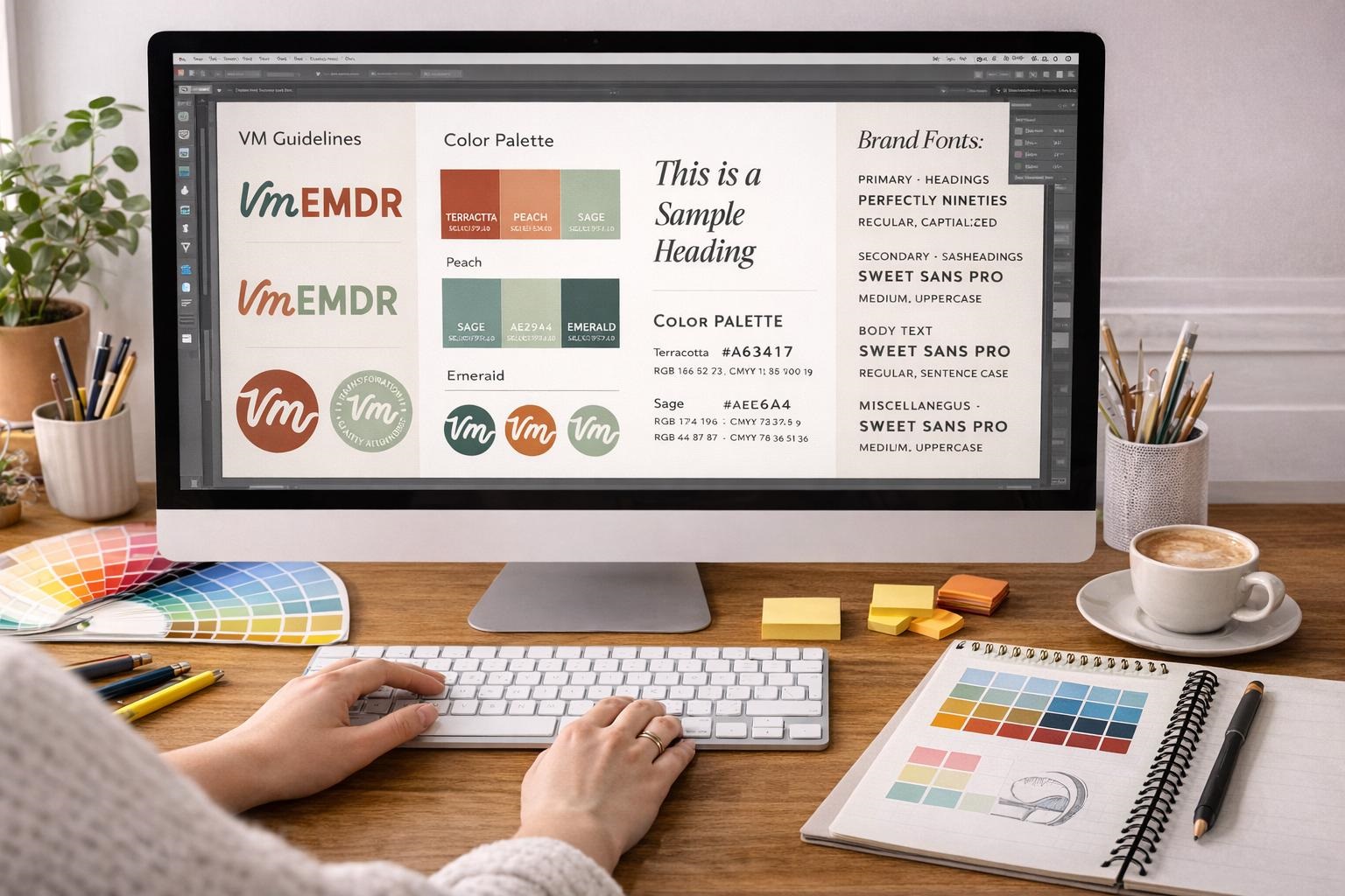
Color is one of the first things people notice when entering a room, visiting a website, or looking at a brand’s packaging. The right combination can make a design feel welcoming, sophisticated, energetic, or peaceful. Poorly coordinated colors, however, can make even a carefully planned project appear confusing.
Choosing a color palette involves more than picking a few attractive shades. It requires understanding how colors interact, how lighting affects their appearance, and how people experience different combinations.
Whether you are decorating an American home, developing a business identity, or designing a digital product, color choices influence both appearance and functionality.
Research also provides useful insights into the relationship between color characteristics and emotional responses. However, color psychology is more complicated than assuming blue always creates calmness or red automatically encourages excitement.
This guide explores practical color theory, research-backed psychological insights, popular color combinations, and step-by-step methods for creating a palette that suits your project.
What Is a Color Palette?
A color palette is a coordinated collection of colors selected for a particular design, space, or visual identity.
Most palettes contain a dominant color, secondary colors, and one or more accents. Neutral shades often provide balance and help important elements stand out.
Why Color Palettes Matter

Consistent colors create visual relationships between different elements.
In a living room, coordinated walls, furniture, and accessories can produce a cohesive appearance. On a website, consistent colors help visitors recognize buttons, navigation elements, and important information.
A well-planned palette can also simplify future decisions because new elements can follow the same visual system.
Where Color Palettes Are Used
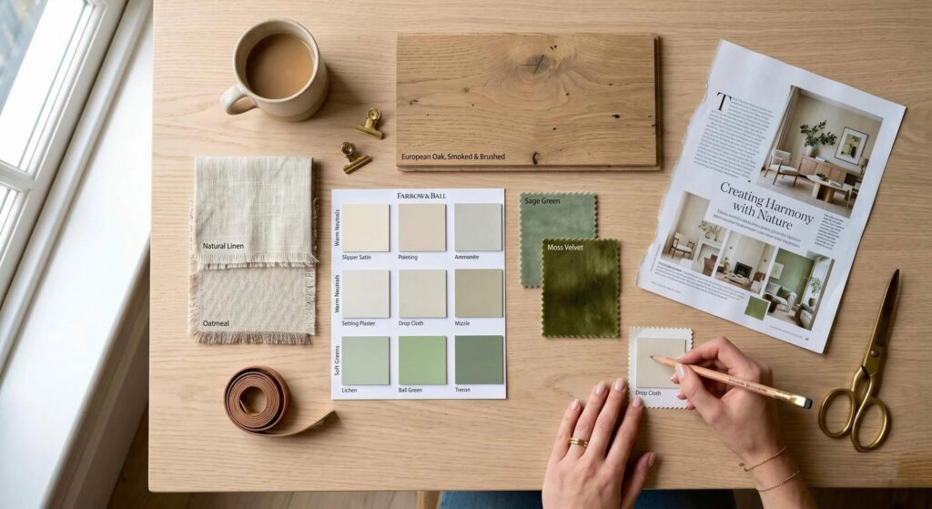
Color selection matters in interior decorating, graphic design, branding, fashion, product packaging, advertising, websites, and mobile applications.
Although each application has different requirements, the principles of harmony, contrast, and consistency remain useful.
Understanding Color Theory Before Choosing a Color Palette
Color theory provides a framework for understanding relationships between colors.
The traditional color wheel is a helpful starting point because it organizes hues in a circular arrangement.
Primary and Secondary Colors
Traditional art education commonly teaches red, yellow, and blue as primary pigment colors.
Combining them creates secondary colors such as orange, green, and purple.
Digital screens use a different system based on red, green, and blue light, commonly called RGB.
This distinction matters when preparing designs for both printed and digital materials.
Hue, Saturation, and Brightness
Hue describes a color family, such as green or orange.
Saturation refers to how intense or muted a color appears. Brightness describes its lightness or darkness.
A highly saturated emerald green creates a different effect from a pale, muted sage green, even though both belong to the same general color family.
Understanding these characteristics makes it easier to adjust combinations without changing their overall identity.
What Psychology Research Says About Color
Color psychology examines relationships between visual colors, human perception, and emotional experience.
One influential study offers insight into why brightness and saturation deserve attention.
The Valdez and Mehrabian Study
In 1994, Patricia Valdez and Albert Mehrabian published Effects of Color on Emotions in the Journal of Experimental Psychology: General.
Their research investigated emotional responses to color hue, saturation, and brightness using the Pleasure–Arousal–Dominance model.
The findings indicated that brightness and saturation had strong relationships with measured emotional responses.
Greater brightness was associated with higher pleasure ratings, while greater saturation was particularly important for arousal.
You can explore the original research on choosing a color palette through the linked American Psychological Association publication.
What the Findings Mean for Designers
The research suggests that emotional responses depend on more than a color’s name.
A bright yellow and a dark mustard yellow may create different impressions despite belonging to the same hue family.
However, the study does not prove that one color combination will produce a specific response in every person or increase sales.
Cultural experiences, individual preferences, surrounding colors, and design context remain important.
Popular Types of Color Palettes
Several established color relationships can make palette development easier.
Monochromatic Color Schemes
A monochromatic palette uses different shades, tints, or tones of one hue.
For example, navy, medium blue, and pale blue can create a cohesive appearance.
This approach works well for minimalist interiors and professional designs.
Analogous Color Schemes
Analogous colors sit next to one another on the color wheel.
Blue, blue-green, and green are common examples.
These combinations often look harmonious because their hues share visual similarities.
Complementary Color Schemes
Complementary colors appear opposite each other on a traditional color wheel.
Examples include blue and orange or purple and yellow.
Their contrast can add energy and direct attention toward selected elements.
Use one color as the dominant shade and the other more selectively.
Triadic Color Schemes
Triadic palettes use three hues spaced approximately evenly around the color wheel.
These combinations can create lively designs, particularly when saturation levels are carefully controlled.
How to Choose a Color Palette Step by Step
A structured process makes color selection easier and reduces unnecessary changes.
Step 1: Define Your Project’s Purpose
Start by identifying what the design needs to accomplish.
A healthcare website, children’s bedroom, restaurant interior, and professional consulting brand have different visual requirements.
Consider the intended audience, practical use, and desired atmosphere.
Step 2: Gather Inspiration
Look for inspiration in architecture, photography, nature, fashion, or existing design work.
Collect references that share the atmosphere you want to create.
A coastal photograph, for example, might inspire a combination of sandy beige, soft blue, sea green, and white.
Step 3: Choose a Dominant Color
Select one color to establish the visual foundation.
In a room, it may appear on walls or large furnishings. On a website, it may guide the brand’s prominent visual elements.
Step 4: Add Supporting Colors
Choose two or three shades that complement the dominant color.
Supporting colors can create distinction without introducing unnecessary complexity.
Step 5: Include Neutral Shades
White, cream, charcoal, beige, and gray can provide visual balance.
Neutrals also make it easier to combine a palette with existing materials and accessories.
Step 6: Test and Refine
Apply your colors to a realistic example before making final decisions.
Observe their appearance in different lighting and compare how they interact at full scale.
Choosing a Color Palette for Interior Design
Home interiors require careful coordination between color, lighting, materials, and room function.
Consider Natural Lighting
Natural light changes throughout the day.
A warm beige may appear brighter near a sunny window and noticeably darker in a shaded hallway.
Test large paint samples on multiple walls before purchasing enough paint for an entire room.
Apply the 60-30-10 Guideline
The 60-30-10 rule is a popular decorating technique.
It suggests using approximately 60% dominant color, 30% secondary color, and 10% accent color.
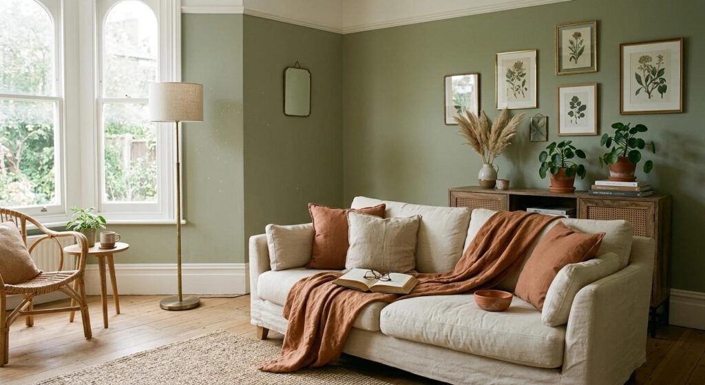
For example, cream walls, sage-green furnishings, and terracotta accessories can produce a balanced room.
These proportions are flexible design guidelines rather than scientific rules.
Coordinate Existing Materials
Flooring, countertops, cabinets, and large furniture influence how new colors appear.
If your home features warm oak flooring, consider whether your chosen colors complement those undertones.
Planning around existing materials can reduce renovation costs and improve consistency.
Choosing Colors for Branding and Marketing
Brand colors contribute to recognition and communicate visual personality.
Define Your Brand Identity
Before selecting colors, describe your business in a few meaningful words.
A company might want to appear approachable, innovative, sophisticated, or energetic.
Use those qualities to guide your exploration.
Create a Flexible Brand System
A brand palette should work across websites, packaging, social media, documents, and advertisements.
Define primary colors, supporting shades, background colors, and accents.
Documenting HEX and RGB values helps maintain consistency.
Avoid Oversimplified Color Psychology
No single color guarantees customer trust, higher conversions, or increased purchases.
Audience expectations and the complete design experience matter.
Test creative variations with real users instead of relying entirely on generalized color associations.
Website Color Palettes and Accessibility
Digital designs must remain readable and easy to navigate.
Understand Contrast Requirements
The Web Content Accessibility Guidelines 2.2 recommend a contrast ratio of at least 4.5:1 for most ordinary text at Level AA.
Large text generally requires at least 3:1.
These requirements help improve readability for people with certain visual impairments.
Avoid Communicating With Color Alone
An error message should not depend only on a red outline.
Add explanatory text or another clear indicator.
Likewise, charts should use labels, patterns, or symbols where necessary.
Test Different Devices
Screens can display colors differently.
Check your palette on desktop monitors, tablets, and smartphones.
Review links, buttons, headings, forms, and interactive states rather than evaluating only a homepage mockup.
Three Practical Color Palette Ideas
The following combinations provide useful starting points for different creative projects.
Natural and Comfortable
<box gap={1}>
<row gap={1}>
{#each [“#F5EFE6″,”#96A78D”,”#C67B5C”,”#51483F”] as c}
<box background={c} height=”40px” flex=”1″ radius=”sm”/>
{/each}
</row>
<caption>Warm cream · Sage green · Terracotta · Dark taupe</caption>
</box>
This combination suits relaxed interiors, lifestyle branding, and nature-inspired designs. Use cream for larger areas and terracotta for smaller accents.
Modern and Professional
<box gap={1}>
<row gap={1}>
{#each [“#19324F”,”#32858A”,”#F5F6F4″,”#E1A16D”] as c}
<box background={c} height=”40px” flex=”1″ radius=”sm”/>
{/each}
</row>
<caption>Deep navy · Teal · Off-white · Muted orange</caption>
</box>
This palette can support business presentations and digital branding. Check exact text-background contrast before implementation.
Soft and Minimalist
<box gap={1}>
<row gap={1}>
{#each [“#E8DED2″,”#B7A89B”,”#D8B9B0″,”#3F3D3B”] as c}
<box background={c} height=”40px” flex=”1″ radius=”sm”/>
{/each}
</row>
<caption>Sand · Mushroom · Dusty blush · Charcoal</caption>
</box>
These understated shades work well for elegant interiors, stationery, and minimalist creative projects.
Common Color Palette Mistakes to Avoid
Using Too Many Bright Colors
Multiple saturated colors compete for attention.
Choose a clear visual hierarchy and reserve stronger colors for elements that need emphasis.
Ignoring Lighting Conditions
Paint swatches and digital previews cannot fully reproduce real-world lighting.
Evaluate the colors in their intended environment.
Following Trends Without Purpose
Popular color combinations may not suit every project.
Choose shades based on function, existing materials, audience preferences, and long-term usability.
Forgetting Accessibility
A fashionable light-gray text color may be difficult to read on a white background.
Check contrast before finalizing digital designs.
Helpful Tools for Creating Color Palettes
Online tools make exploring combinations more convenient.
Adobe Color
Adobe Color helps users explore color harmonies and create coordinated palettes.
Its color wheel can be especially useful for testing analogous and complementary relationships.
Coolors
Coolors provides palette generation and editing features.
It can help designers explore combinations quickly before refining their selections.
Accessibility Contrast Checkers
Contrast checkers evaluate foreground and background color combinations.
Use them to identify potential readability problems before publishing digital content.
Frequently Asked Questions About Choosing a Color Palette
1. What is the easiest way to choose a color palette?
Begin with one dominant color, add two supporting shades, include neutrals, and test the combination in its intended setting.
2. How many colors should I include in a palette?
Three to five principal colors are often manageable for small projects. Larger design systems may require additional functional shades.
3. What is the 60-30-10 color rule?
It is an interior decorating guideline suggesting approximately 60% dominant, 30% secondary, and 10% accent colors.
4. Which colors naturally work well together?
Analogous, complementary, monochromatic, and triadic relationships provide useful starting points. Successful combinations also depend on saturation and brightness.
5. Does color psychology influence emotions?
Research suggests relationships between color characteristics and emotional responses, but effects vary by context and individual experience.
6. How do I choose a palette for my website?
Start with your brand identity, define color roles, test text contrast, and evaluate the design on different screens.
7. Are neutral color palettes boring?
No. Neutrals can create sophisticated designs when combined with varied textures, brightness levels, and carefully selected accents.
8. Can I create a palette from a photograph?
Yes. Nature, architecture, and photography can provide color inspiration. Adjust extracted shades to improve harmony and readability.
Conclusion
Choosing a color palette is an important creative decision that combines visual relationships, practical requirements, and personal preferences.
Understanding hue, saturation, brightness, and established color harmonies can make the process more manageable.
Psychology research provides additional insight into emotional responses, but no combination creates identical feelings for every audience.
Whether you are designing a home, website, or brand identity, begin with a clear purpose, establish a balanced color hierarchy, and test your choices in realistic conditions.
By combining thoughtful experimentation with accessibility and practical design principles, you can create a color palette that looks attractive, communicates clearly, and supports your project’s long-term goals.

Written by Twastia Editorial Team
Twastia Editorial Team shares practical insights about website design, SEO services, Google Ads, content marketing, social media, conversion rate optimization, and digital marketing strategy.
Last updated: Oct 28, 2026
Related posts from Twastia
Explore more useful articles from twastia.com about digital marketing, SEO, websites, ads, content, and growth strategy.